1st StreamRunners internship
A 45 days-long game design and programming internship at StreamRunners
For a total of 45 days in summer 2022 I was an intern at StreamRunners.
Bear in mind the content I will go over is not final and can change a lot between what is said here and the final version.
I worked on the StreamRunners website using new things I didn't know about before, namely Nunjucks for the frontend's server and Tailwind CSS for the client. I read the documentation for both tools and ended up liking both so much I started remaking my own website with them to go faster than before when making modifications. I also used my game design and economy game design skills to prepare reworks for the next set of features updates for the website. I didn't plan those reworks alone as I was working with Nicky Rebergue, he had the experience, I had the knowledge, we worked together to bring the best of both worlds with the goal to improve the overall user experience on the website. Kevin Comte also showed me the ropes of how StreamRunners was managed and how it works as a team. Our goal was to optimise, merge and remove features to make the website more useful and dynamic than it was before. Please look forward to those changes !
I worked on the now released leaderboard rework with Nicky Rebergue. The leaderboard wasn't seeing much activity and needed to get an increase in usage from users. The leaderboard hadn't been changed since the first version of the website and a graphic rework was already in the pipes. The new leaderboard's objectives were :
- Reflect and reward user activity on the site.
- Motivate viewers and streamers to increase participation
The site has a gamified system, meaning I could use PNRC loops (Player state, Needs, Rewards, Challenge) to know what users are looking for !
We decided to reward hearts and likes received by the streamers so they are automatically rewarded by viewers when they make quality content, and they get a visibility boost from the leaderboard. This is targetted at their need of visibility.
We also decided to reward viewer score points. However they were already rewarded by a system that we decided would be partially merged with the leaderboard. We removed weekly and seasonal rewards from that system and put the associated rewards as a basis for the weekly and seasonal leaderboard rewards so players wouldn't feel any decreased nor increased income from the changes.
We wanted to increase the base participation for all users, so we wanted to add a minimum baseline. Using the data that was available at the time we determined a baseline for all the leaderboard categories. Then we also added a bonus based on the amount of users that are above the baseline in each category. Meaning the more users there is above that baseline, the better the bonus.

To help make the changes I made a Google Sheet that would compute rewards depending on the amount of points on the leaderboard, the position and the amount of people so we could adjust the settings on the fly and see how rewards would change depending on how we changed those values.
Then we went on to work on the sponsorship system. I decided to compare the then-current system with other existing products. The game that really showed the system's weaknesses was Werewolf Online/Wolvesville which has gotten over 10 million downloads on Play Store (Android) since its open beta 4 years earlier because of its sponsorship system, as an old member of the translation and moderation team I was invested in the game and knew how fast the game grew and was familiar with most of its systems and how they work. Werewolf Online has asystem that immediately gives 1 item of a customisation set (hooks the player), then after each step you get rewards and gradually get the rest of the set. Collecting skin sets is a really important aspect of Werewolf Online and its economy.
We detected 1 issue that was present in 2 scales of our system : A lack of visibility, on the site and within the reward system. Getting a special crate that gives you a random reward was not enough of a hook and as a user, you can't understand how a random value would be worth your time. Since StreamRunners has a cosmetic system, I thought it would be cool to make a reward system that'd use cosmetics sets to drive system engagement
However, the cosmetics system also had issues that needed a change, cosmetics don't have enough value to be worth their amount of currency as they also lack visibility as they aren't used much and aren't adding much value to profiles, so we decided it would be good to also boost the cosmetics in the profile to make sure users know about cosmetics and use them.
This incentivised a profile page rework which would make cosmetics and the profile page itself more valuable. The profile page would be seen as a tool instead of a simple thing that exists because it's just common to have one on a website even when you don't need one.
Since StreamRunners is looking to add more connections to other sites, I though it would be smart to take advantage of that to upgrade the profile page. Streamers are using Linktree and other websites to show all their links. However those sites don't need to provide proof of account ownership when adding a Youtube link for example, the presentation of those links is usually lacking any personality (which is where customisation comes in !).
The rest of the changes can be read in my internship report that can be downloaded in french in the links section. Reminder : The information in the documents hasn't been updated so they don't reflect the final version of those changes, if they happen at all.
I'd still like to speak about the implementation of the leaderboard rework.
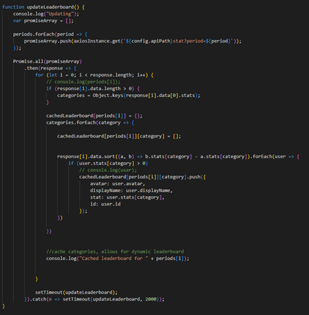
I added a cache system for the leaderboard that would update the whole frontend cache regularly by calling the backend and whenever a user would request its own data from the backend it would update the frontend cache with that portion of data. Requesting the whole leaderboard from the backend was slow and this was an improvement, however it looks like the system didn't make it to production as the leaderboard is still slow and at some point I tested the system on production data and it didn't act like this, so I don't know why it was changed...


This excerpt was use to query and update the leaderboard cache in the frontend
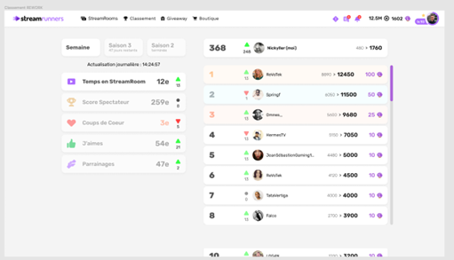
The new design of the page was done in Figma by Mr Rebergue


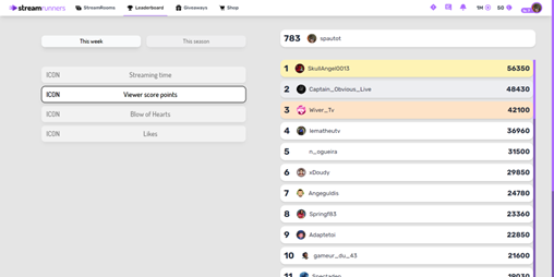
Then I took the result and implemented it using tailwind and nunjucks which I was using for the first time and here's the result. Since then Mr Rebergue showed me the ropes of Figma and have been using Figma since for various UI previews, especially for Posseslime, the game I am working for my 3rd year of game design at ICAN.
I would like to thank Kevin Comte and Nicky Rebergue for this opportunity. They were very welcoming and I'd gladly work with them again ! The things I've learned from the both of them are valuable and have influenced the methods and tools I use in a lot of ways. One example would be this website, everything I learned at Streamrunners prompted me to remake this website from the ground up and make it at least 10 times better than it was before.
